
The existing design lacked a clear and recognizable identity and didn’t reflect the scale or importance of the country’s biggest football tournament. Without a logo or consistent visual system, the tournament blended in with other local competitions and failed to convey prestige.
The goal was to create a confident visual identity that communicates scale, emotion, and clarity, while handling dense information without distraction.
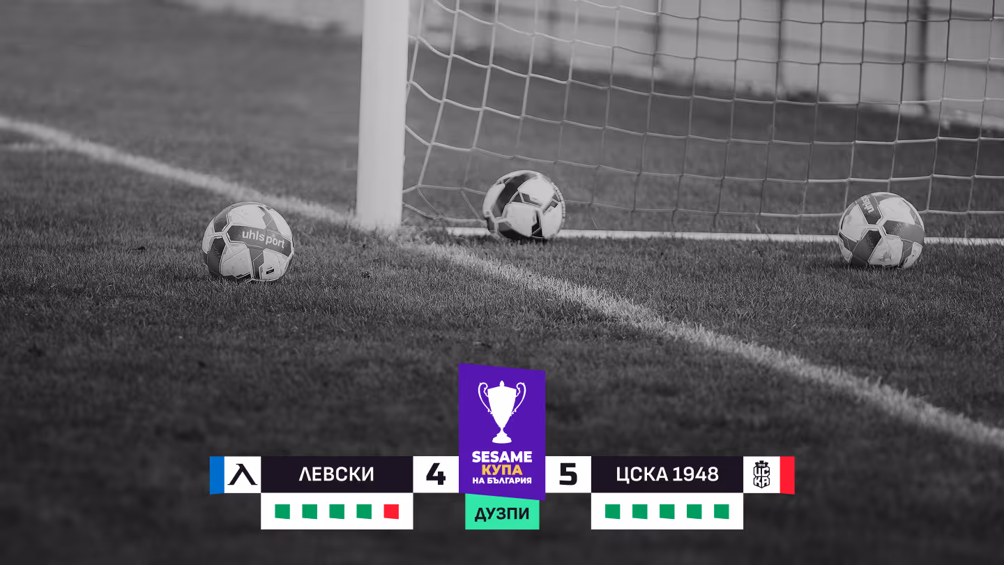
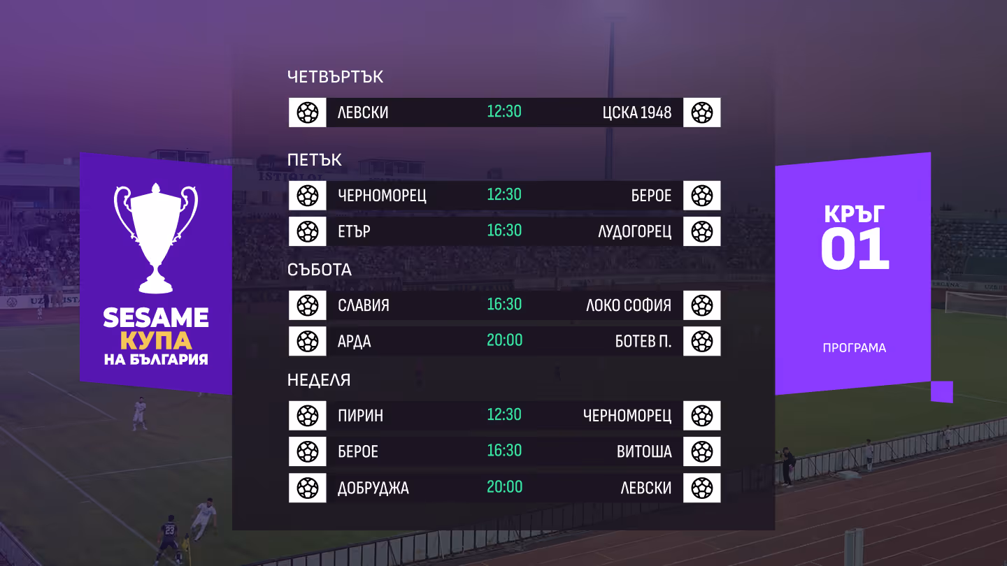
Through iterative design, the visual language evolved toward bolder compositions, higher contrast, and more distinctive graphic elements.
The final result is a clear and recognizable visual system that elevates the tournament’s presence, aligns it with international standards, and provides a flexible foundation across formats and channels.